Tinkering with Particle Matter Data
I live in Örebro, Sweden. The municipality continuously monitors the air quality as measured by particle matter content (PM10). Every day, the average PM10 over 24 hours is published. I thought it would be fun to see what insights we can derive from this data.
There are several sources for particle matter, but traffic is probably the most important in Swedish cities, specifically wear on roads, tyres and brakes. Amount of traffic as well as weather should have a strong impact on the air quality.
Let’s investigate the influence of some specific factors!
This post was prepared as a Jupyter Notebook using Python 2.7.
import matplotlib.pyplot as plt
import numpy as np
import pandas as pd

%matplotlib inline
plt.style.use('ggplot')
We start by downloading the latest version of the data from Örebro Municipality’s website. I use pandas’ built-in csv-reader for the task.
air_quality = pd.read_csv(
    'http://luftmatning.orebro.se/CSV.csv',
    names=['date', 'PM10'],
    skiprows=range(3),
    index_col=0,
    parse_dates=True,
)
A quick plot to get an overview of the data.
air_quality.plot()
<matplotlib.axes._subplots.AxesSubplot at 0x818d550>
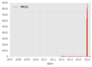
Some values around December 2015 are extremely high. This is likely to be a measurement error or corrupted data. Whatever the cause, let’s drop all values above 400.
air_quality.PM10[air_quality.PM10 > 400] = np.nan
ax = air_quality.plot()
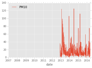
Leading and trailing NaN have no pratical use so let’s remove them but keep the interspersed ones.
air_quality = air_quality.dropna().resample('1D').sum()
air_quality.plot()
<matplotlib.axes._subplots.AxesSubplot at 0x955a6a0>
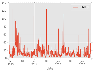
Seasonal Effects
At a quick glance, it seems that high values are more common in spring. Let’s look at the mean values by month!
mean_by_month = air_quality.groupby(air_quality.index.month).mean()
mean_by_month.index = ['January', 'February', 'March', 'April', 'May', 'June',
                       'July', 'August', 'September', 'October', 'November', 'December']

mean_by_month.plot(kind='bar')
<matplotlib.axes._subplots.AxesSubplot at 0x9d4f2e8>
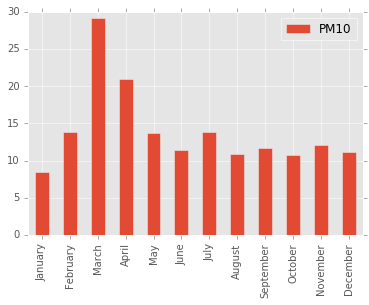
As expected, large values are recorded in March and April. This time of year, road are snow free and the temperatures climb to double digits (centigrade) on a fine day, while drivers still haven’t changed over from the studded tyres used in Scandinavia during winter. Likewise, the icy roads in January seems to bind particles since the lowest average is recorded in this month.
Day of the Week
Traffic flow varies over the week and we should expect this to have an impact on the air quality. Let’s take the mean by day of the week.
mean_by_weekday = air_quality.groupby(air_quality.index.weekday).mean()
mean_by_weekday.index = ['Monday', 'Tuesday', 'Wednesday',
                         'Thursday', 'Friday', 'Saturday', 'Sunday']

ax = mean_by_weekday.plot(kind='bar')
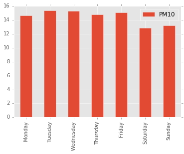
As expected, air quality is better on weekends, but the effect is rather small.
Weather
Let’s look at how weather conditions impact the air quality. We’re going to look at these five variables:
- Precipitation
- Wind Speed
- Wind Direction
- Daytime Peak Temperature
- Relative Humidity
We will download observed values from The Swedish Meteorological and Hydrological Institute, SMHI, as we need.
SMHI makes all observations available as csv-files through an API. You can browse the API yourself (in Swedish) by starting at http://opendata-download-metobs.smhi.se/api/version/latest.atom.
Old observations are split into two files. One file contains data older than three months. This file contains data that has undergone manual scrutiny. A second file contains the more recent data, which has not undergone the same scrutiny. Different types of observations are available with different frequency. We are going to use daily data where available (precipitation and temperature) and resample hourly data in the other cases (wind and humidity).
Precipitation
Rain and snow make roads wet and keeps particles from becoming airborne. Therefore, we should expect lower PM10 on rainy days.
latest_months = pd.read_csv(
    'http://opendata-download-metobs.smhi.se/'
    'api/version/1.0/parameter/5/station/'
    '95160/period/latest-months/data.csv',
    sep=';',
    skiprows=range(13),
    header=None,
    error_bad_lines=False,
    index_col=0,
    usecols=[2, 3],
    names=['date', 'precipitation'],
    parse_dates=True,
)

corrected_archive = pd.read_csv(
    'http://opendata-download-metobs.smhi.se/'
    'api/version/1.0/parameter/5/station/'
    '95160/period/corrected-archive/data.csv',
    sep=';',
    skiprows=range(13),
    header=None,
    error_bad_lines=False,
    index_col=0,
    usecols=[2, 3],
    names=['date', 'precipitation'],
    parse_dates=True,
)

precipitation = corrected_archive.combine_first(latest_months)
Let’s plot a histogram with 1 mm bins.
pm_by_precipitation = air_quality.groupby(
    lambda date: np.floor(precipitation.precipitation.get(date, np.nan)))

pm_by_precipitation.mean().plot(kind='bar')
<matplotlib.axes._subplots.AxesSubplot at 0x96b6fd0>
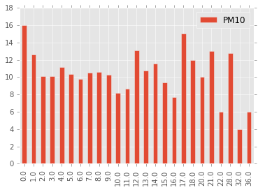
Small amounts of precipitation do indeed lower the amount of particle matter, but the effect vanishes already at 2 mm/day.
Wind
Wind speed and direction could also change the amount of particle matter in the air. In this case, only hourly data is available so we’ll have to resample it.
latest_months = pd.read_csv(
    'http://opendata-download-metobs.smhi.se/'
    'api/version/1.0/parameter/4/station/'
    '95130/period/latest-months/data.csv',
    sep=';',
    skiprows=range(11),
    header=None,
    error_bad_lines=False,
    index_col=0,
    usecols=[0, 1, 2],
    names=['date', 'time', 'wind_speed'],
    parse_dates=[[0,1]],
)
corrected_archive = pd.read_csv(
    'http://opendata-download-metobs.smhi.se/'
    'api/version/1.0/parameter/4/station/'
    '95130/period/corrected-archive/data.csv',
    sep=';',
    skiprows=range(11),
    header=None,
    error_bad_lines=False,
    index_col=0,
    usecols=[0, 1, 2],
    names=['date', 'time', 'wind_speed'],
    parse_dates=[[0,1]],
)
wind_speed = corrected_archive.combine_first(latest_months)
wind_speed = wind_speed.resample('1D').mean()
wind_speed.index.name = 'date'

latest_months = pd.read_csv(
    'http://opendata-download-metobs.smhi.se/'
    'api/version/1.0/parameter/3/station/'
    '95130/period/latest-months/data.csv',
    sep=';',
    skiprows=range(11),
    header=None,
    error_bad_lines=False,
    index_col=0,
    usecols=[0, 1, 2],
    names=['date', 'time', 'wind_direction'],
    parse_dates=[[0,1]],
)
corrected_archive = pd.read_csv(
    'http://opendata-download-metobs.smhi.se/'
    'api/version/1.0/parameter/3/station/'
    '95130/period/corrected-archive/data.csv',
    sep=';',
    skiprows=range(11),
    header=None,
    error_bad_lines=False,
    index_col=0,
    usecols=[0, 1, 2],
    names=['date', 'time', 'wind_direction'],
    parse_dates=[[0,1]],
)
wind_direction = corrected_archive.combine_first(latest_months)
wind_direction = wind_direction.resample('1D').mean()
wind_direction.index.name = 'date'
pm_by_wind_speed = (
    air_quality
        .groupby(lambda date: np.floor(wind_speed.wind_speed.get(date, np.nan)))
)
mean_pm_by_wind_speed = pm_by_wind_speed.mean()
mean_pm_by_wind_speed.index = mean_pm_by_wind_speed.index.map(int)
mean_pm_by_wind_speed.plot(kind='bar')
pm_by_wind_speed..plot(kind='bar')
<matplotlib.axes._subplots.AxesSubplot at 0xc3d1390>
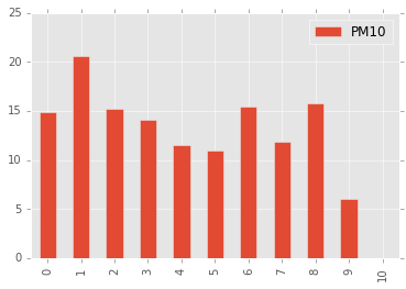
Stronger winds seem to reduce the amount of particle matter in the air. What about the direction?
pm_by_wind_direction = (
    air_quality
        .groupby(lambda date: np.round(wind_direction.wind_direction.get(date, np.nan)/45) % 8)
)
mean_pm_by_wind_direction = pm_by_wind_direction.mean()
mean_pm_by_wind_direction.index = ['N', 'NE', 'E', 'SE', 'S', 'SW', 'W', 'NW']
mean_pm_by_wind_direction.plot(kind='bar')
<matplotlib.axes._subplots.AxesSubplot at 0xeec9588>
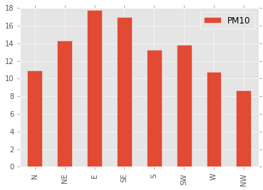
Surprisingly, the direction of the wind seems to have a strong impact on the amount of particle matter. Perhaps this is due to local effects around the point of measurement, or perhaps a consequence of seasonal variations in wind direction.
Daily Peak Temperature
This measurement cross-correlates with season and precipation so it could be hard to figure out the exact cause of any variations due to temperature. Nevertheless, we should expect that warm weather accelerates the wear on roads and tyres.
I’ve chosen to study peak temperature, since traffic is concentrated to the daylight hours and since we hypothesise that high temperatures soften tyres and road surfaces.
latest_months = pd.read_csv(
    'http://opendata-download-metobs.smhi.se/'
    'api/version/1.0/parameter/20/station/'
    '95130/period/latest-months/data.csv',
    sep=';',
    skiprows=range(11),
    header=None,
    error_bad_lines=False,
    index_col=0,
    usecols=[2, 3],
    names=['date', 'temp',],
    parse_dates=True,
)
corrected_archive = pd.read_csv(
    'http://opendata-download-metobs.smhi.se/'
    'api/version/1.0/parameter/20/station/'
    '95130/period/corrected-archive/data.csv',
    sep=';',
    skiprows=range(11),
    header=None,
    error_bad_lines=False,
    index_col=0,
    usecols=[2, 3],
    names=['date', 'temp',],
    parse_dates=True,
)

air_temp_max = corrected_archive.combine_first(latest_months)
pm_by_air_temp_max = air_quality.groupby(
    lambda date: 5*np.floor(air_temp_max.temp.get(date, np.nan)/5.0))

mean_pm_by_air_temp_max = pm_by_air_temp_max.mean()
mean_pm_by_air_temp_max.index = mean_pm_by_air_temp_max.index.map(
    lambda x: '{} to {}'.format(int(x), int(x)+5))
mean_pm_by_air_temp_max.plot(kind='bar')
<matplotlib.axes._subplots.AxesSubplot at 0x9a90ef0>
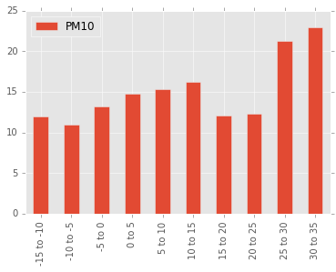
Really warm summer days seem to increase the amount of particle matter. We can also see a peak corresponding to warm spring days.
Relative Humidity
Humidity will influence the time it takes for street to dry up after rain. This should also have an influence on the particle matter in the air.
latest_months = pd.read_csv(
    'http://opendata-download-metobs.smhi.se/'
    'api/version/1.0/parameter/6/station/'
    '95130/period/latest-months/data.csv',
    sep=';',
    skiprows=range(11),
    header=None,
    error_bad_lines=False,
    index_col=0,
    usecols=[0, 1, 2],
    names=['date', 'time', 'humidity'],
    parse_dates=[[0,1]],
)
corrected_archive = pd.read_csv(
    'http://opendata-download-metobs.smhi.se/'
    'api/version/1.0/parameter/6/station/'
    '95130/period/corrected-archive/data.csv',
    sep=';',
    skiprows=range(11),
    header=None,
    error_bad_lines=False,
    index_col=0,
    usecols=[0, 1, 2],
    names=['date', 'time', 'humidity'],
    parse_dates=[[0,1]],
)
humidity = corrected_archive.combine_first(latest_months)
humidity = humidity.resample('1D').mean()
humidity.index.name = 'date'
pm_by_humidity = air_quality.groupby(
    lambda date: 5.0*np.floor(humidity.humidity.get(date, np.nan)/5.0))

mean_pm_by_humidity = pm_by_humidity.mean()
mean_pm_by_humidity.index = mean_pm_by_humidity.index.map(
    lambda x: '{} till {}'.format(int(x), int(x)+5))
mean_pm_by_humidity.plot(kind='bar')
<matplotlib.axes._subplots.AxesSubplot at 0xd0f37f0>
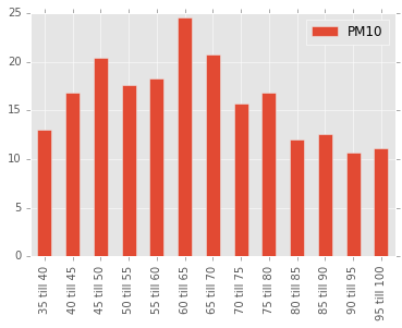
It does indeed seem that high humidity leads to lower amounts of particle matter.
Prediction
Let’s see if we can do something more useful with our data. Can we use it to predict the amount of particle matter given a weather forecast? This requires some form of Machine Learning.
Features
First we need to select the features we want to work with. We’re going to use all the data that we have looked at so far.
The periodic features, season and day fo the week, can be expressed using a pair of sine and cosines. The periodic variable $u$ with period $T$ can be mapped to a pair of features $x_1$ and $x_2$ like this
\[x_1 = \mathrm{cos} \left( \frac{2 \pi u}{T} \right) \\ x_2 = \mathrm{sin} \left( \frac{2 \pi u}{T} \right).\]For the wind, we can use a similar idea. We can use its northern and eastern components as features.
dayofyear = pd.DataFrame(
    zip(
        np.cos(2 * np.pi * air_quality.index.dayofyear / 365.25),
        np.sin(2 * np.pi * air_quality.index.dayofyear / 365.25)
    ),
    index=air_quality.index,
)
weekday = pd.DataFrame(
    zip(
        np.cos(2 * np.pi * air_quality.index.weekday / 7.0),
        np.sin(2 * np.pi * air_quality.index.weekday / 7.0)
    ),
    index=air_quality.index,
)
wind = pd.concat([wind_speed, wind_direction], axis=1, join='inner')

wind = pd.DataFrame(
    zip(
        wind.wind_speed * np.cos(np.pi * wind.wind_direction / 180.0),
        wind.wind_speed * np.sin(np.pi * wind.wind_direction / 180.0),
    ),
    index = wind.index
)
Since precipitation over 2 mm/day had little influence, I let this feature saturate smoothly using the saturate function defined below.
def saturate(x):
    return 2/(1 + np.exp(-2*x)) - 1

precipitation_sat = precipitation.apply(saturate)
I choose to try to predict the logarithm of the PM10 value instead of the absolute value. I define these convenience functions for later use.
def y_transform(y):
    if y == 0:
        return -1
    return np.log(y)

y_inv_tranform = np.exp
Now we are ready to build the feature and target vectors. I choose to also include all values from the day before because I believe this has some predictive power as well. I also do some fiddling to make sure that all NaNs are removed.
target = air_quality['PM10'].dropna().map(y_transform)

data = pd.concat([
        weekday,
        dayofyear,
        precipitation_sat,
        precipitation_sat.shift(freq='1D'),
        wind,
        wind.shift(freq='1D'),
        air_temp_max,
        air_temp_max.shift(freq='1D'),
        humidity,
        humidity.shift(freq='1D'),
    ],
    axis=1,
)

data.columns = [
    'weekday_cos',
    'weekday_sin',
    'dayofyear_cos',
    'dayofyear_sin',
    'precipitation',
    'precipitation_yesterday',
    'wind_e',
    'wind_n',
    'wind_e_yesterday',
    'wind_n_yesterday',
    'temp',
    'temp_yesterday',
    'humidity',
    'humidity_yesterday',
]
data = data.loc[target.index]
data = data.dropna()
target = target.loc[data.index]
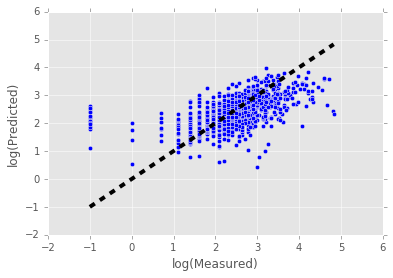
Algorithm
I’ve chosen to use Support Vector Regression with radial basis functions kernel. It is easily loaded from SciKit Learn.
from sklearn.svm import SVR

svr = SVR(kernel='rbf', C=10000, epsilon=0.01, gamma=0.0001)
Perform 10-fold cross validation and plot predicted vs measured values.
from sklearn.cross_validation import cross_val_predict

predicted = cross_val_predict(svr, data, target, cv=10)

fig, ax = plt.subplots()
ax.scatter(target, predicted)
ax.plot([target.min(), target.max()], [target.min(), target.max()], 'k--', lw=4)
ax.set_xlabel('log(Measured)')
ax.set_ylabel('log(Predicted)')
<matplotlib.text.Text at 0xf1341d0>
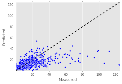
y = np.vectorize(y_inv_tranform)(target)
y_pred = np.vectorize(y_inv_tranform)(predicted)

fig, ax = plt.subplots()
ax.scatter(y, y_pred)
ax.plot([y.min(), y.max()], [y.min(), y.max()], 'k--', lw=2)
ax.set_xlabel('Measured')
ax.set_ylabel('Predicted')
ax.set_xlim([y.min(), y.max()])
ax.set_ylim([y.min(), y.max()])
(0.36787944117144233, 125.00000000000004)
Train the SVR using all but the last 90 days of data and use this model to predict the last 90 days.
svr = SVR(kernel='rbf', C=10000, epsilon=0.01, gamma=0.0001)

svr.fit(data.iloc[:-90,:], target.iloc[:-90])

res = pd.DataFrame(
    zip(
        map(y_inv_tranform, svr.predict(data.iloc[-90:])),
        map(y_inv_tranform ,target.iloc[-90:]),
    ),
    index=data.index[-90:],
    columns=['predicted', 'measured'],# 'humidity'],
)

res.plot()
<matplotlib.axes._subplots.AxesSubplot at 0xf598e10>
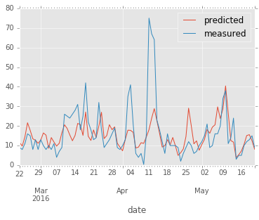
The model does indeed seem to have som predictive power, even though it fails to predict the highest peaks.
Future
To improve accuracy, it would first of all be nice to have more data, especially really high values. Luckily, we gain one datapoint every day. There are certainly other regression methods out there that could be tried. Perhaps some kind of ensemble method could be used.